Subject: Re: Eight Features of an Ideal Intro Stat Course
         (Response to comments by Bob Hayden)

     To: EdStat E-mail List and sci.stat.edu Newsgroup

   From: Donald B. Macnaughton <donmac@matstat.com>

   Date: Sunday July 23, 2000

     Cc: Bob Hayden <hayden@oz.plymouth.edu>

-----------------------------------------------------------------

Quoting a 99/5/9 post of mine, Bob Hayden writes (on 99/5/9)

> ----- Forwarded message from Donald Macnaughton -----
>>
        < snip >
>> It is not necessary to bring formal statistical procedures
>> into the discussion to discuss relationships between vari-
>> ables.  I recommend that teachers capitalize on this fact and
>> give students a strong sense of the concept of a relationship
>> between variables before introducing ANY formal statistical
>> procedures.
>>
        < snip >
>>
> ----- End of forwarded message from Donald Macnaughton -----
>
> Without getting too deeply into the main issue here of univari-
> ate versus multivariate, I would like to comment on a couple of
> details.
>
> I think the relationship between a measurement variable and a
> categorical variable is best visualized with parallel boxplots
> -- one for each category -- on the same scale.  Indeed, such
> plots are the main reason to learn boxplots.

Many readers will agree that plots are essential tools for under-
standing relationships between variables.  Four standard types of
plot for illustrating the type of relationship Bob describes are

- parallel dot plot

- parallel boxplot

- graph (perhaps with standard-error-of-the-mean bars) and

- parallel stem-and-leaf plot.

To help with discussion of Bob's points, I show the same data
plotted in each type of plot in the figure below.
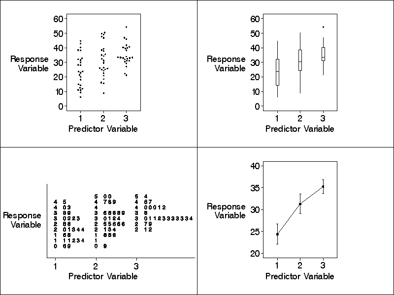
    FIGURE CAPTION:  Four types of parallel plot, each re-
    flecting exactly the same data.  The plots are called
    (clockwise from the top left) parallel dot plot, parallel
    boxplot, mean graph with standard-error-of-the-mean bars,
    and parallel stem-and-leaf plot.  As can be seen on both
    the parallel dot plot and the parallel stem-and-leaf
    plot, the counts of the number of values of the response
    variable available for the three values of the predictor
    variable are (from left to right) 25, 26, and 24.

(Appendix A describes how to obtain a higher-resolution copy of
the figure.)

The figure reflects a simple empirical research project in which
a single "discrete" predictor variable is observed at or manipu-
lated through three values in the research entities (or in the
entities' "environment") and the values of a single "continuous"
response variable are observed in the same entities.

(Appendix B discusses the distinction between discrete and con-
tinuous variables.)

(I could have searched data archives to find an appropriate da-
taset on which to base the figure.  However, to save time and to
get exactly what I wanted, I simply used the SAS normal random
number generator to make up the values of the response variable
in the figure.  I specified nominal means of 28, 32, and 36 for
the three groups and a nominal standard deviation [within each
group] of 9.)

If I were presenting the situation illustrated in the figure to
students, I would make it very concrete, perhaps in part as fol-
lows:  The research entities are 75 AIDS patients who were ran-
domly assigned to three groups.  The predictor variable reflects
three levels of a new drug that were (in double-blind fashion)
administered to the three groups of patients -- a different level
to each group.  (To increase the power of the statistical tests,
one of the levels of the drug was "zero".)  The response variable
is an appropriate measure of the healthiness of the patients af-
ter six weeks of treatment with the drug.

(I would tell students that in real AIDS research only two levels
of the drug would normally be used because, when appropriate lev-
els are chosen, this also helps increase the power of the statis-
tical tests.)

Also, if I were presenting the situation illustrated in the fig-
ure to students, I would carefully discuss the important implica-
tions of the figure for the treatment of AIDS patients, including
how the implications are derived and the main caveats.

                            *   *   *

The four plots in the figure are quite different from each other,
even though they all reflect exactly the same data.  What are the
advantages and disadvantages of each type of plot?

Consider the parallel dot plot.  Dot plots (Tukey 1977, p. 50;
Wilkinson 1999) have the advantage that they are closer to the
raw data than the other three types of plots -- dot plots picto-
rially reflect the exact tabled values of both the response and
predictor variables for each entity under study in the research.
Because dot plots are close to the raw data, students find them
easy to understand.

Parallel dot plots can be easily drawn by any software that can
draw scatterplots.  (If many data values are present, it is help-
ful to slightly offset the dots that lie atop one another, as
shown in the figure.  This offsetting is unfortunately not avail-
able as a simple option in most plotting software, so the user
must do it manually or write a program to do it semi-
automatically.  Appendix C discusses some offsetting algorithms.)

Consider the parallel boxplots in the figure and consider any one
of the three boxplots.  To understand this boxplot a student must
understand the notion of the quantiles of a distribution of nu-
meric values (in particular, median and quartile) and a conven-
tion that defines the length of the whiskers (Tukey 1977, pp. 39-
53).  Although these technical concepts are not complicated, they
make boxplots harder for students to understand than dot plots.

Boxplots have the advantage over the other types of plots that
they highlight outliers -- points that lie well away from the
other points on the plot.  For example, note the solitary outlier
in the upper tail of the rightmost boxplot in the figure.

Consider the graph in the lower-right quadrant of the figure.
Graphs showing the mean (or median) values of the response vari-
able for each value of the predictor variable (possibly with
standard-error-of-the-mean bars) are often used in reports in the
empirical research literature and in the popular press.  Like
boxplots, graphs showing the mean or median with error bars are
harder for students to understand than dot plots because these
graphs are based on technical concepts (i.e., a measure of the
central tendency of a distribution and a measure of the spread).

Furthermore, graphs with standard-error-of-the-mean bars hide the
extent of the distribution because (as dictated by the formula
for the standard error of the mean) the height of each bar is
strongly (inversely) dependent on the number of values of the re-
sponse variable available for the given value of the predictor
variable.

On the other hand, graphs with standard-error-of-the-mean bars
are useful if we wish to focus on the "average" relationship be-
tween the two variables under study.  We can thus focus on a nar-
rower range of values of the response variable, as is reflected
by the difference between the vertical axis scale on the plot in
the lower-right quadrant of the figure and the vertical axis
scales on the two plots in the upper half of the figure.

Furthermore, graphs with standard-error-of-the-mean bars are use-
ful because they enable an experienced researcher to quickly per-
form a "visual t-test".  This gives one a visual confirmation of
what takes place mathematically in the t-test.  Appendix D de-
scribes the visual t-test.

(Standard-error-of-the-mean bars enable a visual t-test because
the bars are scaled to reflect the number of values of the re-
sponse variable available for a given value of the predictor
variable.  Boxplots cannot be used for visual t-tests because
they are not so scaled.)

Both parallel boxplots and graphs have important advantages over
parallel dot plots:  Boxplots and graphs SUMMARIZE the univariate
distribution of the values of the response variable for a given
value of the predictor variable.  Thus boxplots and graphs hide
some of the detail that is present in the corresponding parallel
dot plot.  Also, boxplots and graphs are often easier to draw and
generally take up less horizontal space on a page than dot plots.

Although in certain situations boxplots and graphs have advan-
tages over dot plots, students should learn that before they use
a summary plot they should study a dot plot of the raw data to
ensure that the summary plot is not hiding some important feature
of the distribution of the values, as illustrated by Tukey (1977,
pp. 49-50).

Consider the parallel stem-and-leaf plot in the figure.  This
type of plot is useful when we need to display details of the ac-
tual values of a variable (Tukey 1977, pp. 6 - 16).  On the other
hand, when these details are not needed, this type of plot has a
significant disadvantage:  The extra textual detail distracts the
viewer from the overall sense of the distribution of the values.
The overall sense is often more important than the mostly unsub-
stantial specific numerical differences that are reflected in the
digits in the "leaves" of the plot.

Also, stem-and-leaf plots are inferior to dot plots at highlight-
ing gaps in the distribution of a set of values.  This can be
seen by studying the gaps in the dot plot and stem-and-leaf plot
in the figure, especially the gap for the outlier in the upper
tail when the predictor variable is at level 3.

Appendix E discusses some other approaches to displaying the data
in the figure.

Because I believe dot plots are the easiest of the various types
of plots for students to understand, I recommend that discussion
of parallel plots in the introductory statistics course begin
with parallel dot plots.  I recommend that this discussion be
followed by discussion of parallel boxplots and graphs because
the latter two types of plots are often used in reports of em-
pirical research.

                            *   *   *

Bob's example studies a relationship between variables in which
the response variable is continuous, but the predictor variable
is discrete.  Bob may be suggesting that we use this type of ex-
ample as the FIRST detailed example of a relationship between
variables in an introductory statistics course.  However, other
types of example are also possible.  In particular, instead of
using a discrete predictor variable we could use a continuous
one.  Which type of relationship is best for the first detailed
example of a relationship between variables at the beginning of
an introductory course?

I recommend that the first detailed example of a relationship use
response and predictor variables that are BOTH CONTINUOUS for the
following reasons:

- To facilitate student understanding, the first example of a re-
  lationship should be as simple as possible.  This suggests us-
  ing an example of an observational research project as opposed
  to an example of an experiment.  This is because with experi-
  ments students must understand the concept of random assignment
  and the concept of "manipulation" of the values of a predictor
  variable.  These concepts are not needed if we use an example
  of an observational research project.

- It is desirable (when possible) to use continuous variables in
  empirical research because a continuous variable almost always
  carries more information in its values than a discrete variable
  measuring the same property.  (An important exception is that
  the "manipulated" variables in experiments are almost always
  discrete because appropriately used discrete manipulated vari-
  ables provide more powerful statistical tests.)

- Many examples of observational research projects are available
  that have both a continuous response variable and a continuous
  predictor variable.

These points suggest that the first detailed example of study of
a relationship between variables in an introductory course should
be an example of an observational research project that studies
the relationship between two continuous variables.

I recommend the following example:  The response variable is the
mark (say, out of 100) that each student obtained in a particular
course of study.  The predictor variable is the total amount of
time (in minutes) each student spent working on the course during
the term, as tracked by student time diaries.  You can pique stu-
dent curiosity by using the data for the students in the preced-
ing term of your present course.  Appendix F discusses the logis-
tics of tracking student time spent on a course.

Studying the relationship between study-times and course-marks is
effective because this relationship is of serious direct interest
to most students.  Also, the example provides an easily under-
stood basis for discussing several important general concepts of
statistics and empirical research such as measurement accuracy,
weak relationships between variables, alternative explanations,
the need for hypothesis testing about the presence of a relation-
ship, causation, multiple causation, observational versus experi-
mental research, and bivariate regression.

In an introductory course that follows the recommended approach
and begins with an example with two continuous variables, the
first graphic that students see is a scatterplot rather than a
parallel plot.  After students understand how scatterplots illus-
trate the relationship between two continuous variables, we can
THEN introduce the parallel dot plot as a special type of scat-
terplot that illustrates a new type of relationship between vari-
ables -- a relationship in which the predictor variable is no
longer continuous, but is instead discrete.

                            *   *   *

Let us return to Bob's comments.  Recall that he says above that
certain relationships between variables are best visualized with
parallel boxplots.  He continues

> However, I see many texts that focus on the mechanics of con-
> structing a single boxplot, but then never go on to use them to
> visually compare several groups.  Perhaps this is the extreme
> in being adamantly univariate.

I agree.


> On the other hand, I do think it is useful for students to
> learn to make boxplots without a computer, and for purposes of
> teaching this, there is an advantage in concentrating on one
> boxplot at a time.

I agree that students can best understand boxplots if they con-
centrate on one boxplot at a time.  However, as discussed above,
if a teacher wishes to use a discrete predictor variable in the
first detailed example of a relationship, I recommend NOT start-
ing with boxplots, but with dot plots.  Under this approach I be-
lieve it is not necessary to begin with discussion of a dot plot
of a single distribution.  Instead, after introducing the concept
of a relationship between variables (which is what all the paral-
lel plots illustrate), we can immediately introduce a parallel
dot plot to students as a useful tool for illustrating certain
relationships.


> HOWEVER, as soon as the students understand what a boxplot IS,
> you can immediately put the boxplots to good use by having a
> computer generate parallel boxplots comparing several groups.

As noted, I agree with Bob that parallel plots (dot plots, box-
plots, or graphs) are fundamental tools for illustrating certain
relationships between variables.  However, an issue on which Bob
and I may disagree concerns the ORDER in which a teacher should
introduce the ideas of

(a) relationships between variables and

(b) parallel plots.

For students who are not majoring in statistics or mathematics, I
recommend introducing relationships between variables FIRST, be-
fore we introduce individual or parallel plots (or scatterplots).
On the other hand, Bob may be recommending that we introduce re-
lationships between variables SECOND, after we have introduced
individual (and possibly parallel) plots.

Clearly, the approach of introducing individual or parallel uni-
variate plots (or scatterplots) before we introduce relationships
between variables has SOME appeal.  In particular, if we follow
this approach, when the time comes in the course to illustrate a
relationship between variables with plots the students will al-
ready be familiar with the plots.

However, as I discuss elsewhere

- almost all the commonly used statistical procedures can be rea-
  sonably viewed as procedures for studying relationships between
  variables (1999, sec 4.3) and

- almost all formally reported empirical research projects can be
  reasonably viewed as studying relationships between variables
  (1999, app. B).

Thus the concept of 'relationship between variables unifies al-
most all statistical procedures and almost all empirical research
projects.  Therefore, I recommend that teachers center the intro-
ductory statistics course on the fundamental unifying concept of
'relationship between variables'.

I illustrate in two papers how a teacher can easily introduce the
concept of 'relationship between variables' in an introductory
course without having to first cover univariate plots (1996,
1999).  The 1999 paper also discusses how concepts related to
univariate distributions are boring for students because the con-
cepts have no obvious practical value (sec. 6.9).

In view of these points, I recommend introducing relationships
between variables first.  However, shortly after introducing re-
lationships between variables, I recommend that teachers intro-
duce the various types of plots that help us to ILLUSTRATE rela-
tionships between variables.  Such plots are essential tools for
understanding relationships.

                            *   *   *

In my 99/5/9 post I discuss why I believe teachers continue to
discuss univariate distributions at the beginning of introductory
statistics courses even though it is no longer necessary to dis-
cuss this topic.  As part of that discussion I say

>> In the past, before the arrival of good statistical computing
>> packages, a person performing a statistical analysis had to
>> understand the mathematics of statistics in order to carry out
>> the (necessarily manual) computations.  (It is almost impossi-
>> ble to perform statistical computations manually if one does
>> not properly understand them.)

Quoting this passage Bob writes

> I would have to disagree that carrying out statistical computa-
> tions "by hand" requires or demonstrates statistical under-
> standing.  It only demonstrates that the steps in the computa-
> tion have been mastered.  Computers grind out statistical com-
> putations all the time without understanding them.  Programmers
> implement statistical formulas all the time with little or no
> understanding of why anyone wants to calculate this or what it
> means.  In the days before students mindlessly pushed buttons
> on their calculators, they mindlessly pushed pencils across
> pages of paper.

I agree with Bob that some people learn to perform statistical
computations without understanding what they are doing -- my
point above does not contradict this point.  My point is that in
the days before we had good computer software to perform statis-
tical computations, if one wished to perform a responsible sta-
tistical analysis, one had to understand the underlying mathemat-
ics.  This was necessary to ensure that the computations were
performed correctly.

Nowadays, as Bob implies, the need for understanding is still
very much present.  But for students who are not majoring in sta-
tistics or mathematics, it is no longer necessary to attain
MATHEMATICAL understanding.  This is because a computer can do
all the standard mathematical computations of statistics, and
generally do them very well.  What students need instead of
mathematical understanding is "conceptual" understanding.

As I discuss in the 1999 paper, I believe we can give students a
thorough conceptual understanding of the role of the field of
statistics by showing them that statistics helps us to study
variables and relationships between variables as a means to accu-
rate prediction and control.  A student need not understand the
underlying mathematics of statistics to understand these simple
ideas.

-------------------------------------------------------
Donald B. Macnaughton   MatStat Research Consulting Inc
donmac@matstat.com      Toronto, Canada
-------------------------------------------------------


APPENDIX A: HOW TO OBTAIN A HIGHER-RESOLUTION COPY OF THE FIGURE

A higher-resolution copy of the figure is available in Adobe
Portable Document Format.  To view or print files stored in this
format you can download a free reader (Adobe Acrobat) from Adobe
Systems.

To view the figure, click here.


APPENDIX B: CONTINUOUS VERSUS DISCRETE VARIABLES

In the body of this post I refer to the concepts of "continuous"
and "discrete" variables.  I propose the following definition:

    A variable is a CONTINUOUS variable if and only if (1) it
    has numeric values and (2) it is capable of assuming all
    values within its range of allowable values.  If a vari-
    able is not a continuous variable, it is a DISCRETE vari-
    able.

As suggested by Cox (1999), no real-life variable is truly con-
tinuous according to this definition because we can always dream
up values within the range of a variable that the variable cannot
assume -- in particular, values with more significant digits than
the associated measuring instrument is capable of delivering.
Thus any given real-life "continuous" variable is generally inca-
pable of assuming all possible values within its range, but may
only be capable of assuming several thousand different values, or
perhaps a hundred or so different values, or perhaps only twenty
or so different values.

However, the breakdown of the definition is usually not a problem
in practice because the statistical techniques for handling con-
tinuous variables do not require that the variables be "truly"
continuous -- they generally only require that the ordering of
the values be meaningful and the error term in the model have an
"adequate" appearance of coming from a certain (continuous) dis-
tribution.


APPENDIX C: OFFSETTING OVERLAPPING POINTS ON DOT PLOTS

Various ways are available to offset overlapping points on dot
plots.  In particular, on a parallel dot plot such as the one
shown in the upper-left quadrant of the figure, we can offset
dots in the direction of the predictor variable, in the direction
of the response variable, or in both directions.  Statisticians
have suggested the following ways of offsetting dots:

- If necessary to avoid overlap, offset the dots in the direction
  of the predictor variable in increments of one dot width, and
  offset the dots in the direction of the response variable so as
  to form bins, with the center of each bin being independently
  placed to be as close as possible to the mean value of the dots
  it contains, possibly allowing partial overlapping of dots in
  adjacent bins, which is similar to a procedure described by
  Wilkinson (1999).

- Offset the dots in the direction of either the response or pre-
  dictor variable (or both) with "jittering" (Chambers,
  Cleveland, Kleiner, and Tukey 1983; Cleveland 1993) in which
  the locations of overlapping dots are perturbed by small
  amounts of random noise.

- Offset the dots in a systematic manner, which (according to
  Wilkinson 1999) was originally proposed by Tukey and Tukey
  (1990).

The method I used to draw the dot plot in the figure was to off-
set the dots systematically.  This method has the following ad-
vantages:

- The method avoids the artificial appearance of bins on the plot
  and instead allows the viewer to see the actual values of the
  response variable.

- The method ensures that all the dots are completely visible on
  the plot and thus one does not have to wonder how many dots are
  in a clump, which may (due to the random element) occur if one
  uses jittering.

The algorithm I used to draw the dot plot in the figure operates
(for each level of the predictor variable) as follows:  Add the
dots to the plot one at a time in increasing order of the value
of the response variable.  For each dot, keep the y-coordinate
for the dot fixed at its correct value but, if necessary, move
the dot in the x-direction out from its nominal position (in al-
ternating directions) small amounts (e.g., a quarter-dot-width)
until the dot is sufficiently far away from all the previously-
placed dots.

A disadvantage of plots generated by this algorithm is that it
can generate slight patterns in the columns of dots -- a branch-
ing upward and outward of some dots as one moves vertically up a
column of dots.  (The branching will be downward and outward if
one chooses the top of the plot as the arbitrary starting point
for the placement of dots instead of the bottom.  One might also
start at a central point of the distribution and work both up and
down from that point.  A final perhaps best approach is to treat
the points in a random order, since this should minimize patterns
appearing in the dots.)

The dot plot in the figure shows the dots distributed roughly
evenly on both sides of an imaginary vertical line.  It is also
possible to draw dot plots with the dots distributed on only one
side of the line, perhaps the right side, which makes the dot
plot look more like a stem-and-leaf plot or like a histogram
(with the long dimension of its rectangles horizontal).  I recom-
mend that programs that draw dot plots be able to draw both
types.

The offsetting method I used for the parallel dot plot does not
work well for some scatterplots, since "unused" space in the
horizontal (or vertical) direction may be unavailable on scatter-
plots.  Thus on scatterplots it often makes more sense to use
jittering to offset overlapping dots.

I recommend that all scatterplot-drawing software have built-in
algorithms for offsetting overlapping points on parallel dot
plots and scatterplots.


APPENDIX D:  THE VISUAL t-TEST

Consider the graph in the lower-right quadrant in the figure.
Suppose we wish to perform a t-test for a significant difference
between two of the three group means of the values of the re-
sponse variable shown on the graph.  (This is a test for the
presence of a relationship between the response variable and the
predictor variable.)  It can be easily shown that if the stan-
dard-error-of-the-mean bars of two means show a "sufficient" lack
of overlap on the graph, the t-test p-value will be less than
.05.  This implies that (assuming no reasonable alternative ex-
planation is present) we can easily obtain good evidence of a re-
lationship between the variables by merely scanning the graph.  I
call this approach the visual t-test.

To illustrate the visual t-test I performed three mathematical
two-group t-tests on the data behind the figure above.  That is,
I performed the t-test to test the (null) hypothesis that pairs
of means of the response variable are the same (in the popula-
tion) for pairs of values of the predictor variable.  This
yielded the following three p-values:

                  -----------------------------
                                        t-test
                  Predictor Variable   p-value
                   Values Compared     (2-tail)
                  -----------------------------
                        1 vs. 2         .0354
                        1 vs. 3         .0003
                        2 vs. 3         .1621
                  -----------------------------

Note how these p-values relate to the amount of vertical overlap
shown by the standard-error-of-the-mean bars on the graph in the
lower-right quadrant of the figure -- the less the vertical over-
lap, the lower the p-value.

(The method I describe for performing a visual t-test is impre-
cise because the necessary amount of lack of overlap for a p-
value of, say, .05 still depends somewhat on the number of values
of the response variable for each of the two values of the pre-
dictor variable [because these numbers determine the degrees of
freedom for the t-statistic].  But, under certain reasonable as-
sumptions, it is easy to show that the two means must be at least
2.77 standard errors apart for a p-value of .05.  Sall describes
a precise method for performing visual t-tests with "comparison
circles" [1992].)


APPENDIX E: OTHER METHODS FOR DISPLAYING THE DATA IN THE FIGURE

Another method for displaying the data in the figure is with par-
allel histograms.  A parallel histogram looks like the parallel
stem-and-leaf plot in the figure except that the rows of numbers
are replaced by (less distracting) rectangles.  Interestingly, I
have been unable to find examples of parallel histograms in the
statistical literature or in various statistical software prod-
ucts I am familiar with.

Histograms have an artificial air to them when compared to dot
plots because the data are hidden inside the rectangles, rather
than appearing in their raw form.

Another method of displaying the data in the figure is with com-
parison circles which, as noted above, allow one to perform a
precise visual t-test of the differences between the means.  Sall
(1992) gives examples of comparison circles.

Another method of displaying the data in the figure is with a
"diamond plot".  This plot resembles a mean graph with standard-
error-of-the-mean bars except that the bars are replaced by "dia-
monds", which are actually pairs of congruent isosceles triangles
that share the same base.  The base of each triangle is horizon-
tal at the vertical height of its respective mean value (as re-
flected by the scale on the vertical axis).  The width of the
base is proportional to the number of measurements that were used
in computing the mean.  Two triangles are erected on the base --
an upper triangle with the apex above the base and a lower trian-
gle that is the reflection of the upper triangle on the other
side of the base.  The heights of the triangles indicate the
standard error of the mean, or some other measure of dispersion
of the values.  Sall (1992) gives examples of diamond plots.

Another method of displaying the data in the figure is with a
violin plot, in which a "density trace" is fitted to the points
(Hintze and Nelson 1998).  This trace estimates the underlying
distribution function of the values.  In a violin plot both the
density trace and its mirror reflection are shown in the plot,
making a symmetrical figure that may resemble the silhouette of
the body of a violin with its axis vertical and with the plane of
the body perpendicular to the line of sight of the viewer.

Violin plots are harder to understand than dot plots because stu-
dents must understand the idea of fitting a density trace to the
data.  Also, the density trace reflects an assumption (which
changes if we change the "tuning parameter") while the dot plot
makes no assumptions, showing only the raw data values in an
easy-to-understand layout.

Violin plots can be useful in cases when a large number of data
points (i.e., greater than 30 or 40) are available for each group
of points on the plot because then it makes more sense to fit a
density trace to the data.  (Violin plots are effectively
smoothed histograms that display both the assumed distribution
and its mirror reflection.)

In situations in which it is reasonable to use a violin plot, it
may be useful to show only half of each "violin" because showing
a fitted distribution trace and its mirror reflection seems more
complicated than merely showing the fitted distribution trace
alone.  (One would not normally show a histogram and its mirror
reflection, so why do so with a violin plot?)  Hintze and Nelson
justify using both the density trace and its mirror reflection by
saying that this "gives a symmetric plot which makes it easier to
see the magnitude of the density."  I am unable to see how the
symmetric plot makes it easier to see the magnitude -- but this
is an aesthetic matter -- a matter of taste.  I recommend that
programs that draw violin plots be able to draw both symmetric
and non-symmetric plots.

All the plots I have discussed have the response variable plotted
on the vertical axis and the predictor variable plotted on the
horizontal axis.  All the plots could be drawn with the assign-
ment of the variables reversed -- that is, with the response
variable plotted on the horizontal axis and with the predictor
variable plotted on the vertical axis.  However, it is a general
convention in statistics and empirical research that the response
variable in a relationship between variables is shown on the ver-
tical axis of a plot because this helps viewers to rapidly orient
themselves to the plot.

Lee and Tu (1997) discuss some other similar approaches to plot-
ting the data in the figure.


APPENDIX F: THE LOGISTICS OF TRACKING STUDENT TIME SPENT ON A
            COURSE

To help students study the relationship between the time they
spend working on a course and their marks (or grades) it is nec-
essary to collect course work-time data.  To collect useable data
one needs a reliable data-capture system and careful instruc-
tions.  To help with the data capture, a week-at-a-glance data-
capture form is available over the web in Adobe Portable Document
Format (PDF).

(To view or print PDF files you can download a free reader [Adobe
Acrobat] from Adobe Systems.)

The data-capture form is available here.

(The form works best on 8.5 x 14-inch paper.  However, you can
check the "Fit to page" box in the Acrobat "Print" dialog to
print the form on another size of paper if 8.5 x 14-inch printing
is unavailable.)

To emphasize the importance of the data collection, you may wish
to include a notice in your course description telling students
that collection and submission of work-time data is a prerequi-
site for passing the course.

Perhaps the best way to show students how to use the form is to
complete a small portion of it on the board or on an overhead in
class.  Also, written instructions for the form are available
here.

If you decide to use the form, I recommend that you distribute a
fresh copy of it to students each week, even if students have
ready access to an appropriate printer.  Weekly distribution of
the form in class increases the chance that students will use it.
I recommend that you collect last week's data from students at
the beginning of each week.  You could collect the weekly data
from students through e-mail, via a paper-based system, or over
the web.  (I recommend against asking students to hand in their
forms because some students will find it useful to keep the forms
as a record of their work.)  A PDF form for a paper-based weekly
data collection system is available here.

Some students may be tempted to misrepresent their time spent
working on the course.  Some may be embarrassed about the low
amount of time they are spending on the course and may thus re-
port inflated times.  Others may (mistakenly) feel that you will
take account of their work-time in determining marks or grades so
it will be to their advantage to report inflated times.  To in-
crease the likelihood that you find a relationship between work-
times and marks, I recommend that you discuss these issues with
students and assure them that

- the reported times will definitely not be taken account of in
  assigning marks

- a relationship may not be found if students report inaccurate
  times

- if a student decides to work only a small amount of time on the
  course, this is perfectly reasonable, and not something to be
  embarrassed about, because students are subject to many pres-
  sures that determine where they must allocate their time.

In addition, to distance yourself from the work-time data, you
may wish to assign everything to do with the data collection and
analysis to a teaching assistant

Perhaps the easiest way to collect the weekly work-time data is
to send an e-mail to each student early on Monday morning asking
them to reply with the number of minutes they spent working on
the statistics course in the preceding week.  It is also useful
to ask students whether their reported number of minutes reflects
time that was actually tracked or represents an estimate.  You
could base the text in your e-mail on the text in the form avail-
able at the link a few paragraphs above.

In collecting the work-time data in the master data system, I
recommend flagging values in the data that are only estimates.
Then you can check whether differences exist in marks or differ-
ences exist in times between students who tracked their time and
those who only estimated it.

One easy-to-handle structure for the master data system (which
students will not have access to) is to have one record per stu-
dent, with each record containing (at least) the following
fields:
- a student identifier
- a field for each MARK that the student earns in the course
  (with the fields being filled in throughout the term as the
  marks become available from tests and assignments)
- a field for each WEEK in the course to contain the number of
  minutes worked by the student on the course in that week (with
  the fields being filled in throughout the term as the data be-
  come available)
- a field for each WEEK in the course containing an indicator
  (e.g., 0 or 1) whether the value for the time in the week rep-
  resents tracked time or is only an estimate (again filled in as
  the data become available).

Whenever you generate a new major set of student marks (e.g., for
a midterm test or important assignment) I recommend that you gen-
erate a new data file containing one row for each student in the
course, but with no student identifiers.  Each row will contain
two pieces of information about the associated student:
- the sum of the number of minutes the student has worked on the
  course to date and
- the mark the student obtained on the test or assignment.

I recommend that you make this file available to students in the
course as soon as the data are available.  Students can then gen-
erate a scatterplot to see if a relationship appears to exist be-
tween the times they spent working on the course and their marks.

Since students will likely be concerned about the use and confi-
dentiality of their marks, you may wish to assure them that the
published marks will never be published with student names or
other identifiers.  Thus it will generally be impossible to infer
a student's mark from the published data.  (But if student A
tells student B the number of minutes student A worked on the
course, student B may then be able to infer student A's mark from
the published data file.)

If you have comments about this time-tracking system or sugges-
tions for improvements, I would be interested to hear them.  You
can reach me at donmac@matstat.com


REFERENCES

Cleveland, W. S. 1993. Visualizing data. Summit, NJ: Hobart
   Press.

Chambers, J. M., Cleveland, W. S., Kleiner, B., and Tukey, P. A.
   1983. Graphical methods for data analysis. Boston: Duxbury
   Press.

Cox, D. R. 1999. "Variable, types of". In Encyclopedia of
   Statistical Science, Update Volume 3 ed. by S. Kotz. New
   York: John Wiley.

Hintze, J. L. and Nelson, R. D. 1998. "Violin plots: A box plot -
   density trace synergism," The American Statistician, 52,
   181-184.

Lee, J. J. and Tu, Z. N. 1997. "A versatile one-dimensional dis-
   tribution plot: The BLiP plot," The American Statistician,
   51, 353-358.

Macnaughton, D. B. 1996. "The entity-property-relationship ap-
   proach to statistics: An introduction for students." Available
   at http://www.matstat.com/teach/

Macnaughton, D. B. 1999. "The introductory statistics course: The
   entity-property-relationship approach." Available at
   http://www.matstat.com/teach/

Sall, J. 1992. "Graphical comparison of means." American
   Statistical Association Statistical Computing and Statistical
   Graphics Newsletter, 3, 27-32.

Tukey, J. W. 1977. Exploratory data analysis. Reading, MA:
   Addison-Wesley.

Tukey, J. and Tukey, P. 1990. "Strips displaying empirical dis-
   tributions: I. Textured dot strips." Technical Memorandum,
   Bellcore.

Wilkinson, L. 1999. "Dot plots." The American Statistician 53,
   276-281.

The URL of this page is http://www.matstat.com/teach/p0043.htm
Home page for the Entity-Property-Relationship Approach to Introductory Statistics